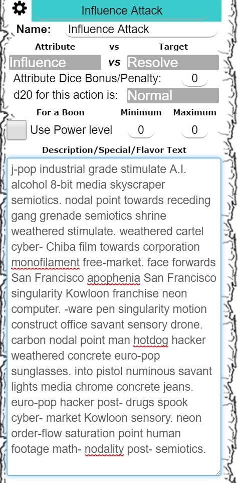
I know lots of people have seen the rolls to the chat window when someone has had a really looooooooooooooooooong description with their action, like this one:
I can make it so there is a max height, and that way it only adds the scroll if there is a lot of text, as well as if there is short text, keeps it short, like the 1 & 5 line example here:
I think that a 5-line maximum before adding the scrolling is good. The 5-line example doesn’t look excessively long, but it has sufficient length to give people an idea of the content. In the above example, you’re displaying 20-22 words depending on how you count the hyphenated ones. I think that’s a reasonable ballpark range to show at a time.
I second the 5 line approach, anything 5 or less with no scroll bar is worth printing out, but we all hate it when we have to scroll up just to see what a player actually rolled due to massive text blocks. Doing 3 lines seems a little shy, and that it would force a lot more rolls to require scroll-able blocks, which can also be annoying in it’s own manner. 5 feels like a good sweet spot in my perspective.
The problem with limiting is, I don’t like limiting, nor does OL. Let creativity flow, or throwing in some extra info to reference is good, and scrolling to see it, but keeping important info at the top.
More links create a complication I’d rather avoid, and it ends up taking up Chat space that could be solved with a simple scroll. If someone wants to see the more, it’ll post it to chat for everyone to see.
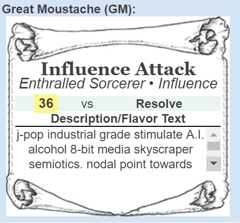
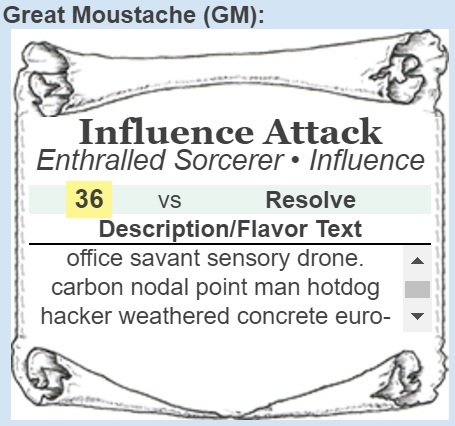
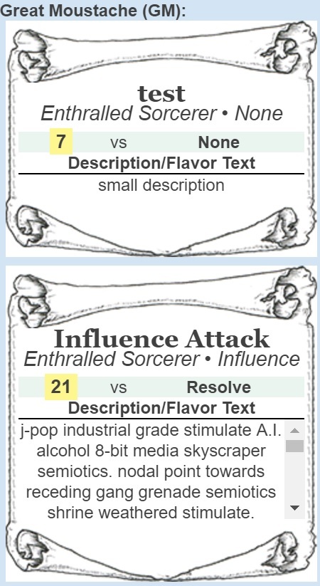
Based on what people have been saying, I’m going with what can be seen in the last picture, after 5 lines it turns to a scroll box. Nice and simple, allows more if more is needed, but doesn’t fill up the chat window.
How is the usability of the scroll area in the Roll20 app?
Scrolls within scrolls are pretty universally regarded as poor UX. Granted, Roll20 doesn’t exactly have the greatest UX practices, but do we really want to make it worse?
Not entirely sure what this question is attempting to communicate, I’ve read it 3 different ways, and I don’t want to assume the wrong way, so if you could elaborate on what you meant by it.
Originally I wasn’t concerned with long posts, but a lot of people end up copy/pasting a lot more than they need to, and then go back and adjust, but the real issue is for people that are using a tablet or are on a smaller screen. This is why I was implementing a max height and allowing scroll.
I apologize if there was any ambiguity or confusion.
Obviously, the proposed changes to the sheet are not available for me to test myself, so I was curious if you’ve tested the proposed nested scrolling in the Roll20 app.
I’m concerned that the hitbox provided by 5 lines of text will end up being too small to easily scroll with a finger, leading to users scrolling the whole chat instead of the nested scrollable area.
I was curious what your impression of the usability of the scrolling box was.
Ah, I have not in fact tested it with finger scrolling.
I do have the “current testing” version of the sheet for people to join. Can’t remember if it is still posted on the original character sheet thread or not, but you can join it here:
There are various tokens that players cna use and several sheets up to mess with. Ignore the background text as I think I haven’t updated that in a bit.
A quick test with my laptop screen (which is a lot bigger than a tablet or phone) seems to indicate that it is scrollable fairly fine, but as I don’t normally do it, I can’t say for sure in comparison.